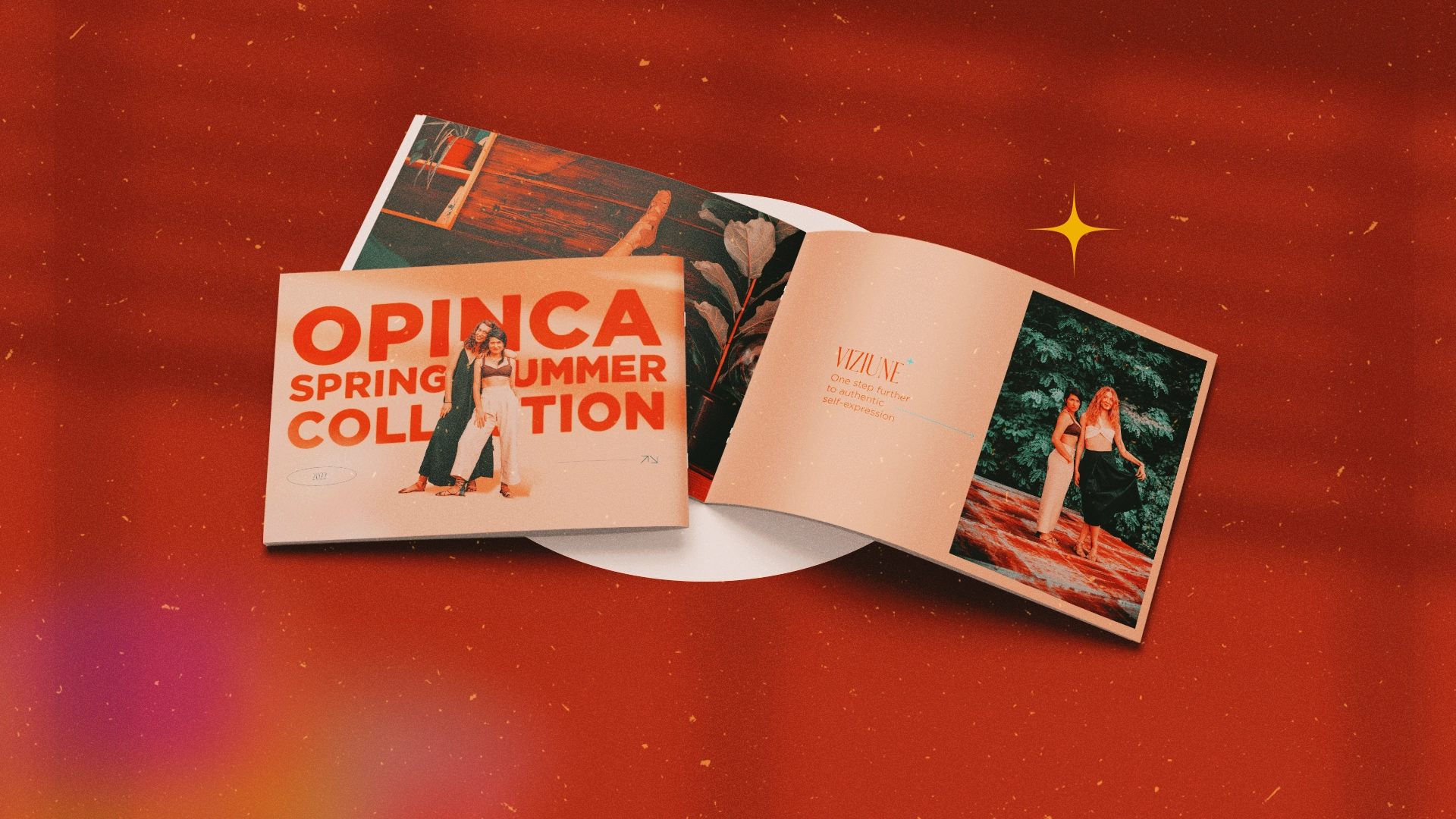
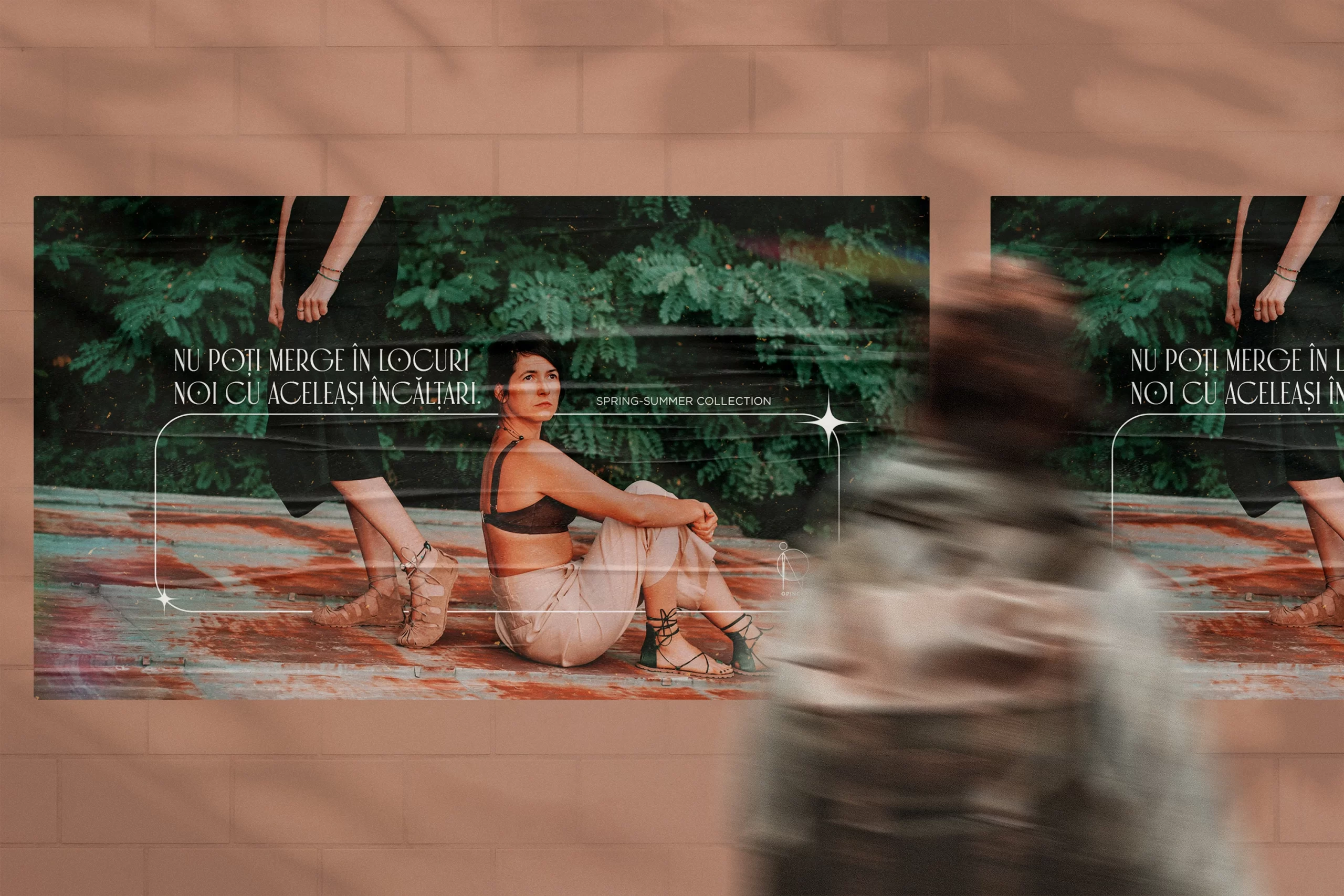
We took the traditional hand crafted style, which is infused in the shoes from Opinca and combined it with a californian 90’s vibe, capturing both the attention to detail while keeping the whole visual identity fresh and catalog-ready.
Brasov, the home of Opinca, is a mountain city, so the base of the visual identity should be made of blue and greenish tones, very earthy and cold. This also helps us ground the brand with some serious roots, in terms of personality and vision. This represents the foundation or the core values.
On top of that, we add the flavor, the californian, sunny beach-side, fashion week vibe. The contrasting values of these two styles merge together to create not only a powerful structure in visual representation but also a very liberating and open to change one.
We believe in achieving clarity through creativity and when it comes to digital communication, both businesses and people are more driven than ever in taking action and inspiring others to do so.